Your website is up and running. Now, how do you learn who your visitors are so you can turn them into prospects? That’s what a lead generation landing page is for. Present a free product, service, or piece of content, then collect emails with a lead capture form.

What is a lead generation landing page?
Landing pages serve more specific purposes than homepages. For example, an e-commerce clothing store might have a landing page for its newest product – a limited-edition Star Wars hoodie. You will ‘land’ on this page after clicking on an ad, newsletter link, or search result. The page may contain a call-to-action button that will add the hoodie to your cart.
Unlike click-through pages (such as the above example), lead generation landing pages don’t lead directly to a purchase. Instead, they collect personal information about visitors so you can contact them later. They usually end with a lead capture form that asks for the reader’s name and email address.
What is an opt-in page?
An opt-in page is any page where users can subscribe to your mailing list. Here, we’ll treat it as synonymical with a lead generation landing page – both are here to encourage users to leave their contact info. An opt-in page might involve downloading a lead magnet or simply joining a newsletter.
What is a squeeze page?
A squeeze page is a type of landing page that serves to collect users’ email addresses. It focuses on a single offer, e.g., registration for an event or downloading an ebook. It won’t have multiple sections or long presentations, which might be necessary for lead generation landing pages that collect more personal details.
Why does my business need a lead generation landing page?
According to CSO Insights, 68% of businesses admit that they struggle with lead generation. Without leads, there are no sales. But that doesn’t mean you need to pour cash into cold calling or hire a marketing agency. Let your website do the work!
Most visitors won’t buy from you right away. But if you get their contact information, you’ll be able to reach more people with marketing campaigns and have them warm up to your products or services. If you research the needs and problems your audience faces and set up a landing page that gives them a solution – e.g., a free SEO tool or sewing pattern – they’ll happily fill out a form to grab it.
To make sure your inbound marketing (e.g., blogging and social media posting) pays off, have a lead capture page ready to collect user data. Statistics show that:
- Content marketing generates 3 times as many leads as outbound marketing, costing 62% less (Demand Metric).
- 68% of B2B businesses generate leads with strategic landing pages (Marketo). Don’t stay behind!
- The average conversion rate of a landing page is 4.02% (Unbounce). That means 4 leads per 100 visitors – and it’s easier to get 100 website visitors than send out 100 targeted cold emails.
By tracking who ends up on your landing page, you can understand your audience better, which translates to more effective marketing. Test different landing pages to see which of your buyer personas has the most potential and how to approach them.
Every business can benefit from lead gen landing pages, but it’s especially true if your sales cycle is longer than average. For example, SaaS (software as a service) purchases don’t happen overnight. It takes 6 to 8 marketing touches before a lead is ready to be passed to the sales department (here’s why).
How to design a high-converting lead generation landing page?
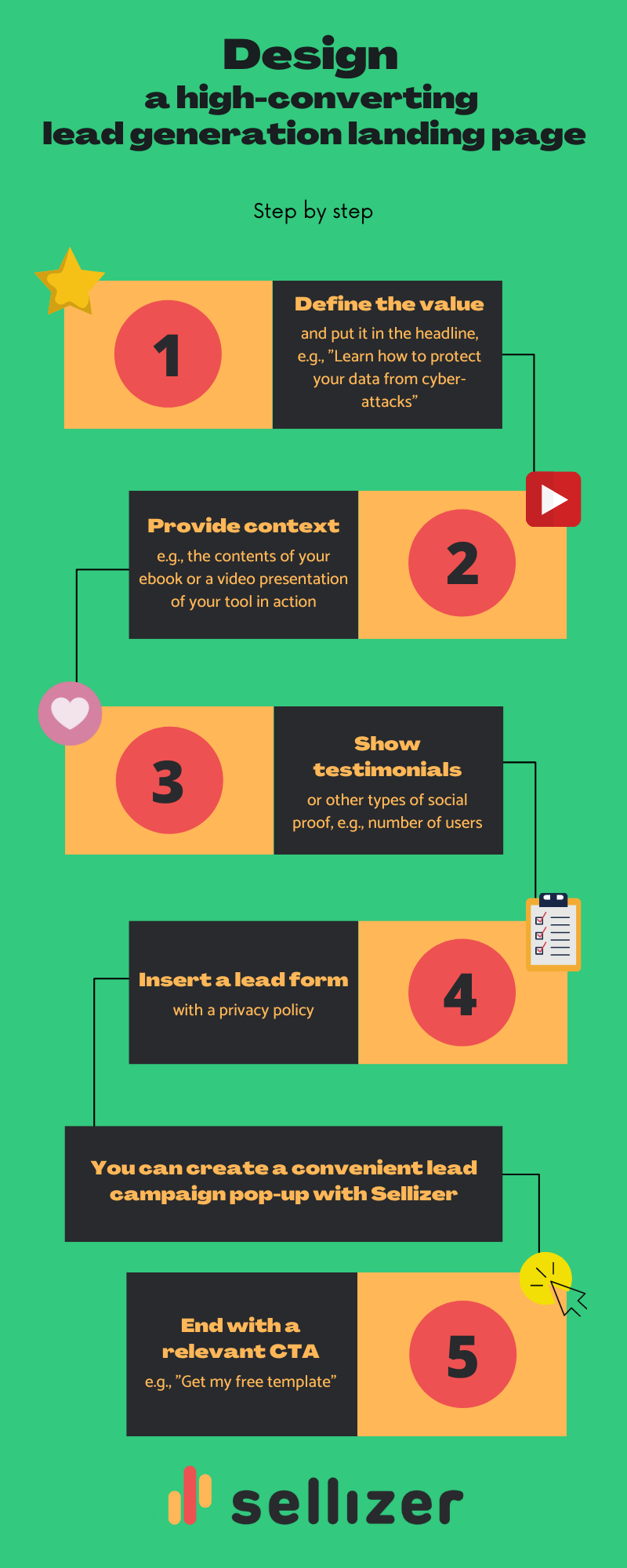
Best practices to create an effective opt-in page
Your lead gen landing page needs a solid design and a persuasive copy if you want it to convert. What does that mean in practice?
- Tailor the landing page for a specific audience. Don’t try to make it appeal to everyone – that’s the role of your homepage.
- Keep the style consistent with the rest of your website. Some experimenting and A/B testing is more than welcome but let it remain ‘you.’
- Write concisely and make the copy point clearly to the next step. Visitors should be able to get what they came for immediately, without scrolling through walls of text in search of the CTA button.
- Use eye-catching visuals, such as high-quality photos, screenshots, and presentation GIFs or videos. By showing the lead magnet in practice, you will convey the value better with less text.
- Make sure the page loads fast and displays correctly on mobile devices.
- Minimize distractions such as links, pop-ups, and buttons leading to other pages. Make sure your readers scroll down to the form – or see it right away without any scrolling.
How to capture leads without a landing page?
There’s one problem with landing pages. They need traffic, which usually comes from ads. SEO helps, too, but it might take months before your landing page ranks in Google. What if you don’t want to wait or pay for an advertising campaign? Good news. You can easily capture leads on those pages of your website that already have lots of visitors!
For example, you could set up a lead campaign pop-up with Sellizer. Have it appear on your most popular blog posts and turn some of that hard-earned traffic into leads.
When someone tries to leave your page, a customized form will appear. Potential leads will be encouraged to enter their details and download a file (e.g., an ebook or white paper). Each recipient will also get a personalized message from you.
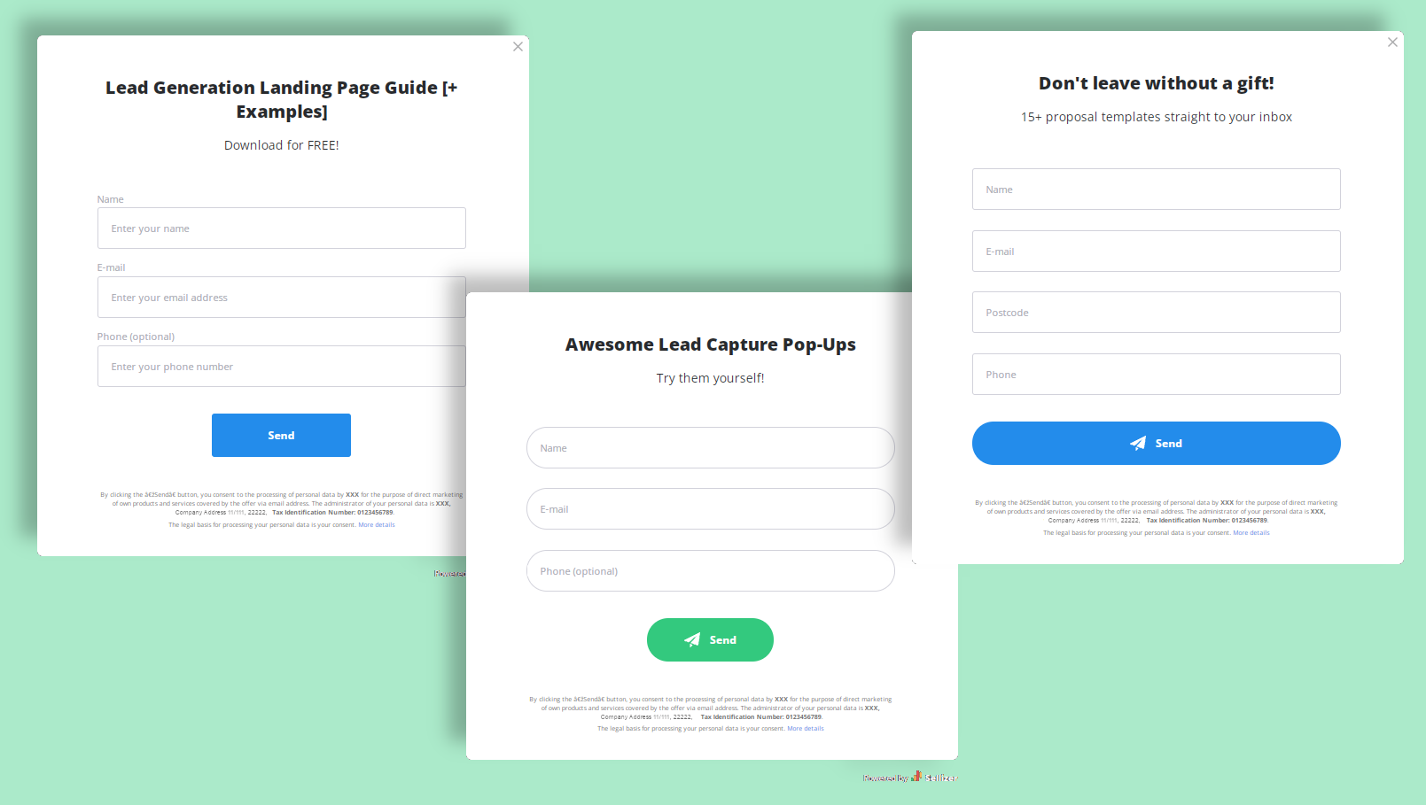
You can then manage the leads you’ve collected within your Sellizer account. Assign them to salespeople manually or distribute them automatically among your team – the choice is yours.
What’s more, you’ll be able to see who opened the file and how much time they spent viewing it. Seize the opportunity to follow up – send a reminder, survey, or start a conversation with the most interested leads.
What to include in a lead capture form?
The more valuable your lead magnet is (think a white paper vs. a simple contract template), the more personal details you can ask for in return. With a short ebook, it’s best to only require a name and email address, or even just the email address. A free 10-minute consultation gives you the excuse to request additional information, such as:
- company name,
- country,
- phone number,
- company size,
- job title.
The more data you collect about your leads, the easier it is to nurture and turn them into customers. However, the conversion rate of your lead generation landing page will suffer if you demand too much information.
One way to solve this problem is to initially give a bit of value, then gate the rest. For example, you could have an open-to-use calculator on your website but only send detailed reports to users who fill out the form.
Opt-in page examples with different lead magnets
Now, let’s look at some actual lead generation and squeeze page examples so you can get a feel for what works and what doesn’t. If you’re up for a challenge, try to identify the areas for improvement by yourself before reading our critiques!
Software tour – Salesforce’s opt-in page
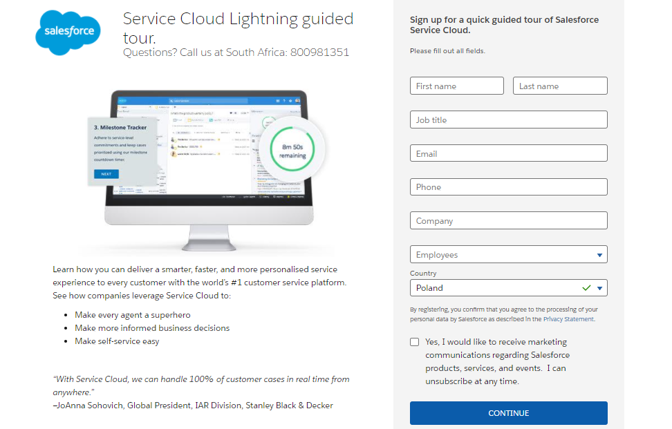
This landing page is part of a localized campaign – there’s a South African contact number under the headline. It’s a good idea to create different landing pages for each market and take advantage of local SEO.
What works:
- The simple design with no distractions and the picture that shows value. Users immediately get a glimpse into how they can use the software.
- The concise copy, focusing on benefits instead of features. The short description under the screenshot immediately answers the visitor’s most important question: what’s in it for me?
- The whole page, including the form, is visible without scrolling down. Users can sign up immediately, which is sure to boost the conversion rate.
What could be better:
- The headline could be more direct, e.g., “See Service Cloud Lightning in action.”
- The text on the CTA button could be more action-oriented, e.g., “Sign me up” or “Book my tour.”
- A headshot next to the testimonial would strengthen the social proof and add a human element to the page.
Ebook – Livespace’s squeeze page
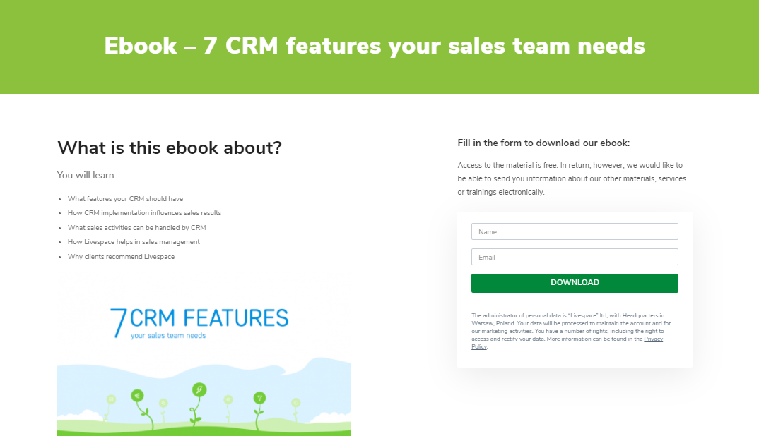
Livespace, a CRM software provider, prepared a free ebook about features to look for in CRMs. With a healthy balance between useful knowledge and promotional content, it might just be the push Livespace’s visitors need before jumping into their lead funnel.
What works:
- The short form that doesn’t ask for a lot of information.
- The clean design with minimal text. Since visitors only need to enter their name and email address, they won’t need much convincing to download the ebook.
- The content summary in bullet points. People who choose to opt-in know precisely what they’re going to get.
What could be better:
- The image looks redundant and could be replaced with a few scaled-down sample pages from the ebook.
- There could be a stronger value proposition – why does your sales team need these 7 features? Will it help them close more deals or reduce their workload?
Report – Litmus’ lead generation landing page
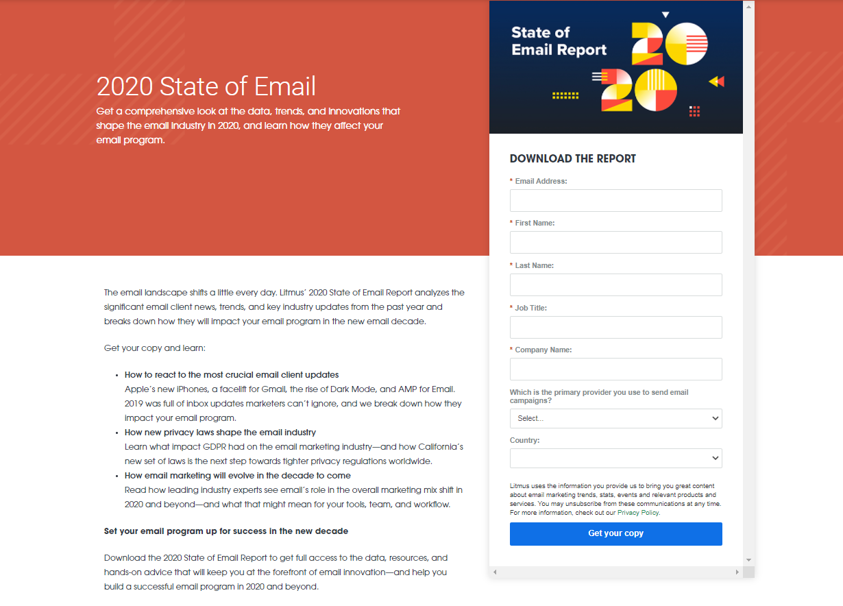
How to generate quality leads for email testing software like Litmus? It’s a great idea to attract people interested in email trends. A yearly industry report holds enough value to gate it behind a slightly longer form and get valuable details such as the readers’ companies and job titles.
What works:
- The value proposition under the headline creates a sense of urgency. One may think: “Have I fallen behind the trends? I must find out!”
- The bright blue CTA stands out, and the text drives action.
- The content summary does a great job of sparking interest and urging readers to learn more.
What could be better:
- A first-person CTA (“Get my copy”) would have a better click-through rate, as proved by Unbounce’s case study.
- The banner could be more visually appealing.
Newsletter – Backlinko’s squeeze page
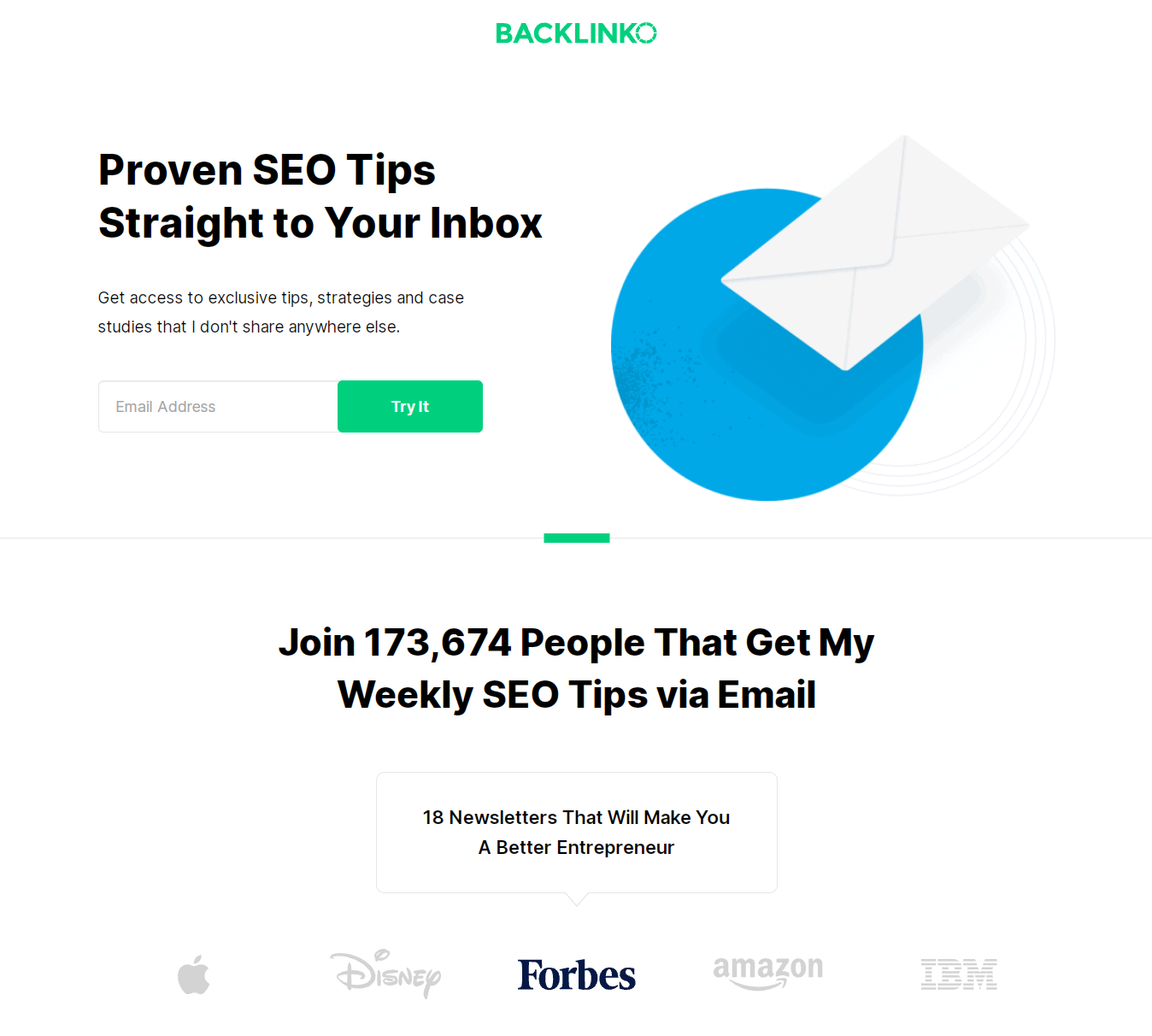
There’s no lead magnet on this squeeze page. Still, Backlinko’s mailing list has grown to an impressive size just because their newsletter is so helpful.
What works:
- Compelling social proof – 170k+ current recipients and the recognition Backlinko’s newsletter got on Forbes.
- The focus on the reader and the exclusive value – you won’t find these SEO tips anywhere else, so why wouldn’t you sign up to get them?
What could be better:
It’s hard to find anything wrong with this lead generation landing page. If you have an idea, tell us in the comments!
Challenge – TechWithTris’ opt-in page
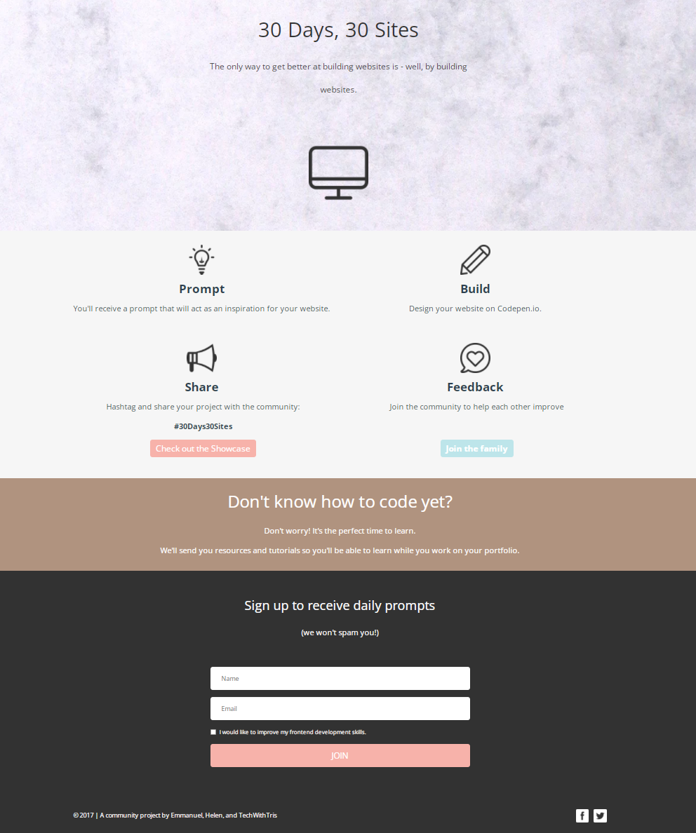
This opt-in page is a bit different – it invites you to partake in a website building challenge! It does require you to use Codepen.io, though, which means it could act as a lead generation landing page. Challenging your visitors is an excellent idea if you’re a provider of creative tools.
What works:
- The clean design with little text and relevant icons.
- Stating a pain point – “Don’t know how to code yet?” – then offering a solution in encouraging words. Now the visitor has no excuse to leave without signing up!
What could be better:
We’d change the headings that are just nouns to something more dynamic. How about “Build 30 sites in 30 days”, “Get a prompt,” and “Give feedback”?
Whitepaper – Tableau’s lead gen landing page
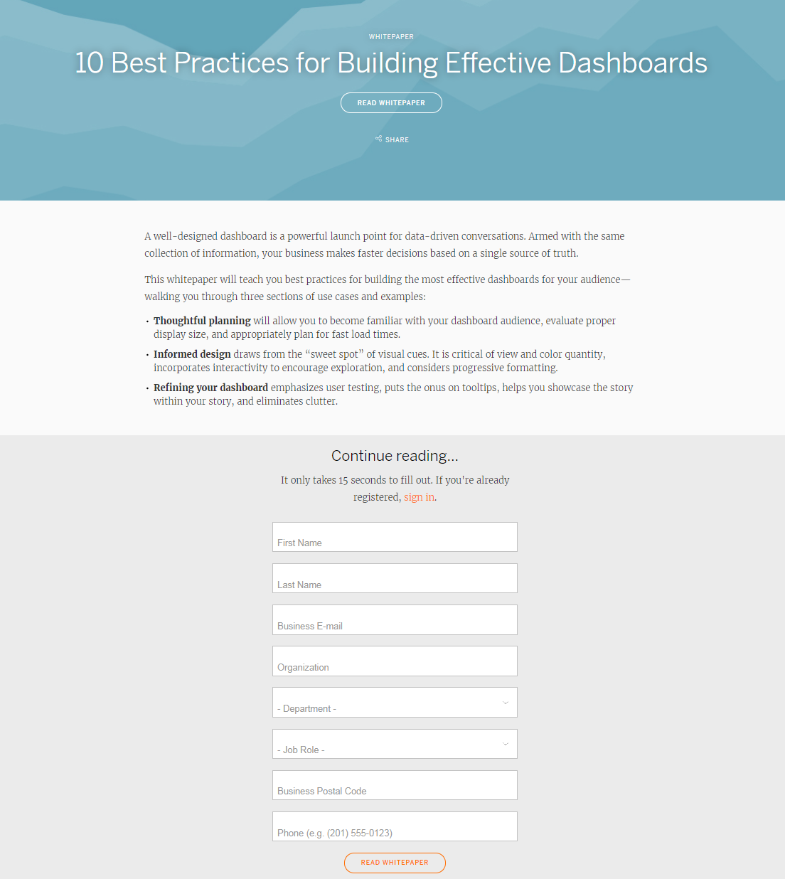
Tableau generates leads by giving out white papers in exchange for quite a lot of information. This landing page features a minimalistic design, emphasizing the text that tells you what the white paper is about.
What works:
- The urge to “Continue reading” after laying out the contents.
- The ‘breathing’ design – there’s enough empty space, and the page is easily scannable.
What could be better:
- You have to scroll down or click on the CTA button under the headline to find the form. The button could be bigger or stand out with a contrasting color.
- The summary suffers from too many nominalizations – the phrasing “collection of information” and “incorporates interactivity to encourage exploration” is complicated and not very exciting to read.
Webinar – Traffic and Funnels’ opt-in page
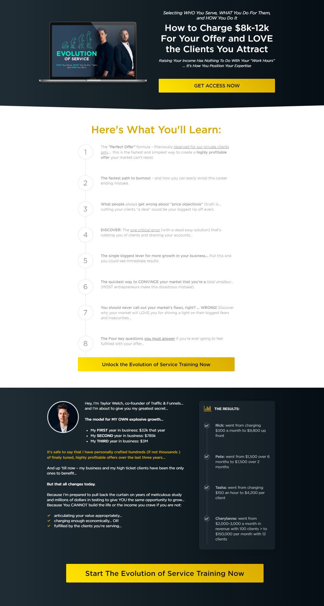
Traffic and Funnels’ lead gen landing page is more extensive than the previous examples. When you click on one of the three CTA buttons, you’ll see a pop-up with a lead capture form. You can sign up for the webinar after entering your name, email address, and phone number.
What works:
- The professional-looking design with CTA buttons that jump out at you – it’s hard to resist clicking.
- The summary presented as a numbered list. You’re not getting some tips; you’re going to learn eight lessons that will help you grow your business!
- The host’s personal story and testimonials are backed with data and numbers, making them more credible.
What could be better:
The page is pretty much flawless. Is there anything you would change? Tell us in the comments.
Guide – Fisher Investments’ lead capture page
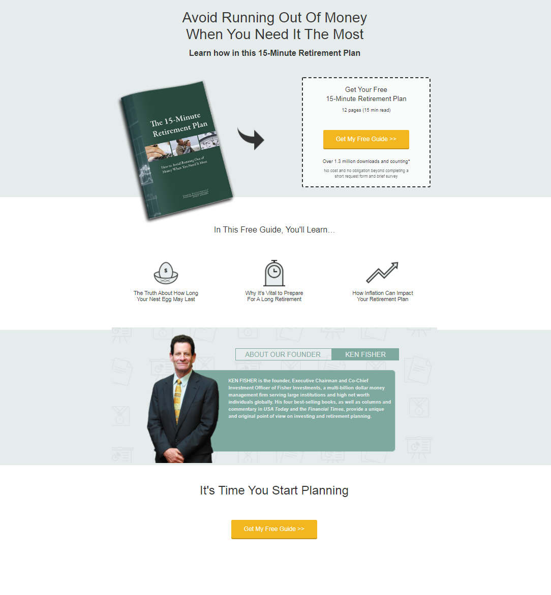
Another way to generate leads is to offer a free guide that solves a specific problem your target audience faces. Fisher Investments is an independent money management firm, so they share wisdom about personal finance in exchange for the visitor’s name, phone number, email… and full residential address.
What works:
- The opt-in page is short and sweet. It conveys a strong value proposition in simple words. Who wouldn’t want to avoid running out of money?
- The digital product is presented as a physical booklet, so you feel like you’re getting a real gift.
- The CTA button stands out, and the first-person copy is compelling to click.
What could be better:
After clicking on the CTA button, we’re redirected to another page with the lead capture form. That’s fine, but the page loads a bit slowly, which might affect the conversion rate.
ROI calculator – Karmen Kendrick Creative’s lead generation page
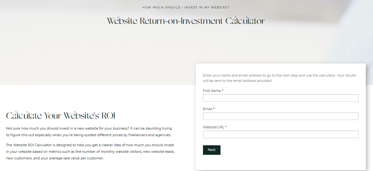
It’s an excellent idea for a service provider or agency to have an ROI calculator on their website. Karmen Kendrick Creative’s potential customers can use it to prove to themselves that investing in a new website will pay off. The calculator will also show them what budget they should aim for based on metrics like their average sale value per customer.
What works:
- The description under the headline shows an understanding of the reader’s challenges, so they feel taken care of and given accurate data.
- The black CTA button stands out from the clean white surroundings.
What could be better:
The opt-in page looks pretty generic. There’s plenty of free space, so they could easily add a GIF showing the calculator in use, or a bit of social proof, even if it’s just the number of users so far.
Template – HubSpot’s opt-in page
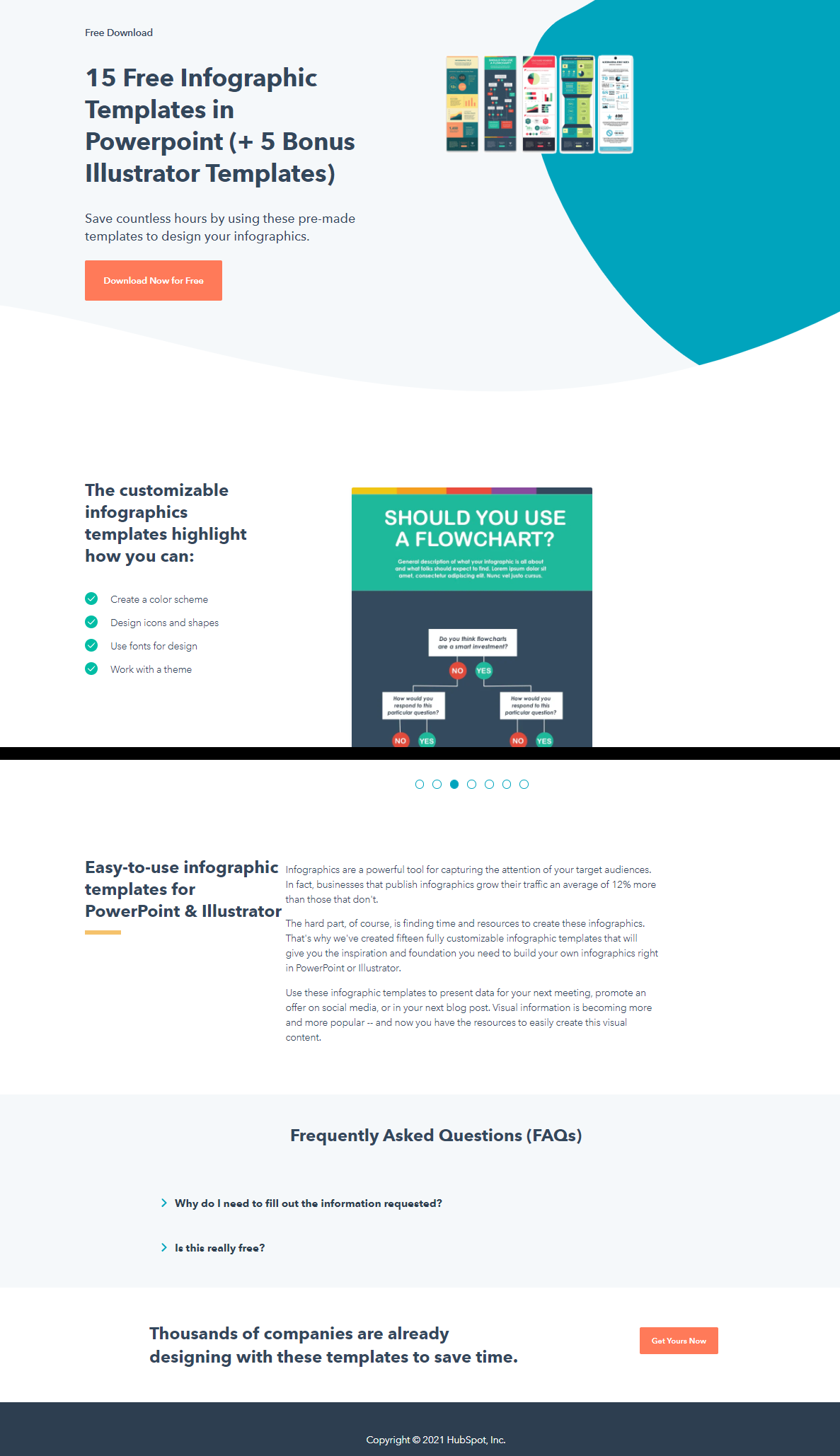
HubSpot’s landing pages are nothing short of textbook perfect. The above example has a strong value proposition (“save countless hours”), displays sample templates from the bundle so you can see it’s worth downloading, and contains no distractions such as clickable logos.
What works:
- Even without scrolling down, you see a GIF with all the infographic templates the bundle contains. What you’re going to get is there before you immediately – no guessing and no need to ask questions.
- If you do scroll down, you’ll find out the templates are customizable and that infographics can increase the traffic on your website by 12%. Still not convinced? There’s a FAQ that resolves your doubts about leaving your data.
- The page ends with social proof – thousands of companies are already using these templates. You don’t want to stay behind your competitors, do you?
What could be better:
The presentation GIF in the middle of the page could be more readable, but it’s not a big problem since most users know PowerPoint and can customize a template without instructions.
Create a lead capture page and turn your website visitors into customers
Now you know what makes an effective lead generation landing page. Mobilize your content team to create enticing lead magnets and watch them bring new leads to your business every day. Remember to tweak your landing pages sometimes and check how they’re performing. Maybe a pop-up on your blog could work even better?
If you’d like to test lead generation pop-ups on your website, sign up for a free 14-day trial of Sellizer – a comprehensive sales support tool.